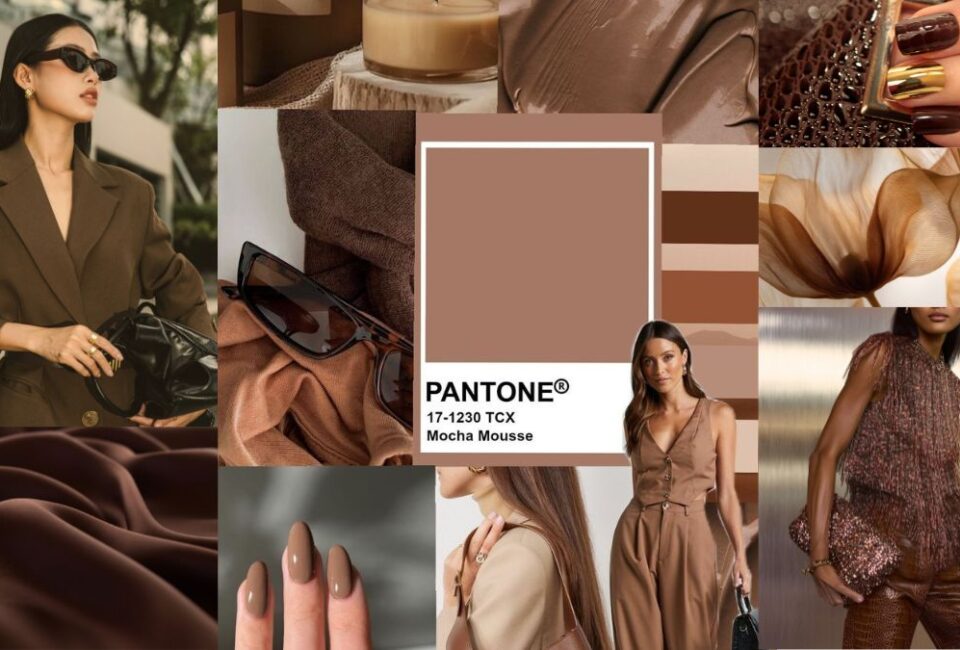
The Quiet Luxury Colour Palette
There is a reason the Quiet Luxury Colour aesthetic has endured for decades. It is not trend-led or logo-driven, and it does not rely on seasonal “statement” colours. Instead, it is built on a restrained, intelligent palette that signals polish, confidence, and taste often regardless of price point. What makes the Quiet Luxury colour palette especially relevant now is its accessibility.
When your wardrobe is anchored in the right shades, even high-street pieces read as considered and expensive. It is the antidote to impulse buying, colour chaos, and outfits that date too quickly. This is exactly the kind of quiet luxury logic the CSC woman values. Below, I break down the core Quiet Luxury colour palette and how to build it on a realistic budget without sacrificing elegance.
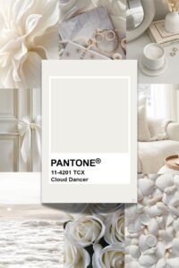
The Foundation: Cream, Ivory & Soft White
Every Quiet Luxury Colour wardrobe begins with creamy neutrals rather than stark white. Ivory knits, ecru trousers, and soft off-white shirts immediately look more refined and forgiving, particularly in winter light. On a budget, these shades are far easier to elevate than bright white.
They hide wear better, layer seamlessly, and work across seasons. A cream jumper with tailored trousers will always look intentional even if both are from the high street. Look for fine-gauge knits, ribbed cotton, or softly structured shirts in these tones rather than anything too sheer or overly crisp.
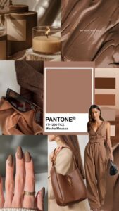
Camel, Beige & Warm Taupe
Camel is the unsung hero of the Quiet Luxury Colour palette. It brings warmth, heritage, and instant sophistication, especially when worn head-to-toe or layered with cream. You do not need a designer coat to make this work. A well-cut camel blazer, a beige knit, or taupe trousers instantly elevate denim, black basics, or even activewear.
These shades also photograph beautifully, which explains their dominance on polished Instagram feeds. High-street brands like COS and Arket consistently execute these colours well in quality fabrics and timeless silhouettes.
Navy Instead of Black (When You Can)
Black has its place, but Quiet Luxury Colour style leans towards navy as its dark neutral of choice. Navy feels softer, more expensive, and far more “old money” when paired with cream, beige, or gold jewellery. A navy jumper, tailored trousers, or structured coat can replace black in most outfits while instantly shifting the tone from sharp to refined.
Navy also layers beautifully with camel and grey, making it a more versatile investment. For budget buys, Uniqlo does exceptional navy staples in merino wool and tailored cuts that hold their shape.

Soft Grey & Charcoal
Grey is essential, but tone matters. Opt for soft dove grey, pale marl, or deep charcoal rather than flat mid-grey. These variations look intentional and editorial, particularly when styled monochromatically. A grey knit worn with matching trousers, or layered under a camel coat, creates that effortless Chelsea-weekend look without trying too hard.
It is also one of the easiest colours to repeat throughout a capsule wardrobe without anyone noticing. This is where Mango and & Other Stories excel offering elevated greys that feel far more premium than their price point.

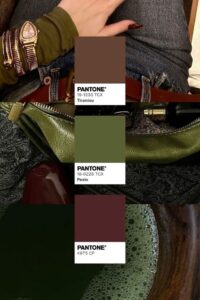
Muted Accents: Burgundy, Forest Green & Chocolate
The Quiet Luxury Colour palette is neutral-led, but it is never boring. The key is restraint. Instead of brights, introduce colour through deep, heritage-leaning shades. Burgundy knits, forest green accessories, or chocolate brown boots add richness without overpowering an outfit.
These tones feel seasonal, intelligent, and quietly confident—particularly when paired with cream or camel. Used sparingly, they also allow you to refresh your wardrobe each year without starting from scratch.
Why This Palette Always Looks Expensive
This Quiet Luxury Colour palette works because it mirrors the wardrobes of women who dress for longevity, not attention. These shades age well, mix effortlessly, and rarely clash. They also allow fabric, cut, and fit to do the talking which is where even budget pieces can shine.
By limiting your palette, you reduce styling errors, avoid trend fatigue, and create outfits that feel cohesive rather than assembled. This is the backbone of quiet luxury dressing, whether your coat is cashmere or high-street wool.
The Chic Style Collective Edit
If you want your wardrobe to look more expensive without spending more, start with colour discipline. Build around cream, camel, navy, grey, and one or two rich accents. Shop less, repeat more, and let your palette do the heavy lifting. This is the Quiet Luxury Colour palette at its most practical and its most powerful.
Want more articles like this? Sign up to the Chic Style Collective newsletter for exclusive editor’s picks, capsule wardrobe guides, and seasonal style tips straight to your inbox.

![Affordable Fashion Labels [Aspiga]](https://www.chicstylecollective.com/wp-content/uploads/2025/07/Chic-Style-Collective-Hero-Image-334-365x274.jpg "Chic Style Collective | 9 Under-the-Radar Affordable Fashion Labels Every Stylish Woman Should Know in 2025")
![Holland Cooper Base Layers [Holland Cooper]](https://www.chicstylecollective.com/wp-content/uploads/2025/10/Chic-Style-Collective-Hero-Image-855-365x274.jpg "Chic Style Collective | Holland Cooper Equestrian: The Base Layers Every Stylish Woman Needs This Season")
![Barbour Wax Jacket [Shutterstock]](https://www.chicstylecollective.com/wp-content/uploads/2025/03/CSC-Featured-image-944-365x274.jpg "Chic Style Collective | The Timeless Appeal of a Barbour Wax Jacket: An Icon of British Heritage")
